Outcome
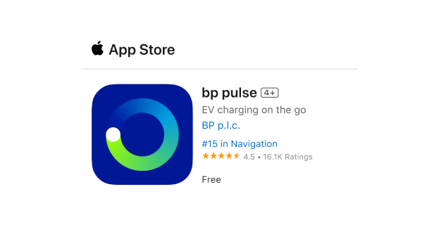
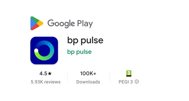
4.5 stars on the App Store and Google Play
Research
Service Design
UX
UI
Client:
BP Pulse
My role:
Principal Product & Service Designer
Project:
End-to-end electric vehicle (EV) charging experience
Summary:
BP Pulse had two separate apps, 9 charging unit manufacturers with inconsistent interfaces, and non-standardised signage. I led research, service design and UX across the app, physical charging units and signage, expanding the brief beyond app consolidation to fix the full customer experience. I aligned engineering, procurement, signage and product teams throughout, and convinced the Head of Design to change the product direction based on research findings.
4.5 stars on the App Store and Google Play
EV adoption depends on charging being reliable and easy. BP Pulse had two separate apps, 9 charging unit manufacturers with inconsistent interfaces, and non-standardised signage across its estate. Customers were relearning how to charge their car every time they used a different unit. The fragmentation wasn't just a UX problem, it was a barrier to EV adoption and a direct risk to BP Pulse's market position as the UK's largest public charging network.
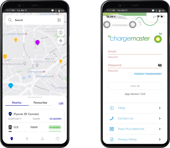
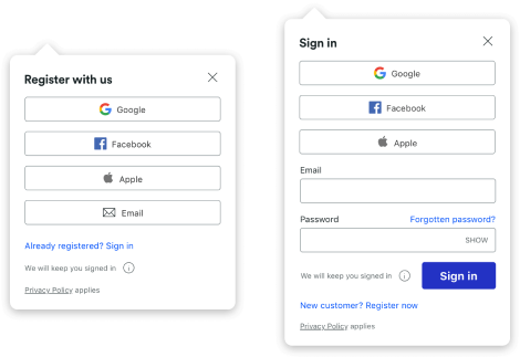
BP’s original separate public & home charging apps.
The brief assumed the problem was fragmentation. Before any design work, I proposed running qualitative research to find out whether that was the right frame.
I screened, recruited and ran 12 interviews with EV owners and presented findings to executive leadership.
The headline insights:
“It was a nightmare. We had absolutely no clue what we were doing! I just remember waving credit cards at a charger, trying to figure out the cable.”
Jess - 30 - London

The Head of Design had already secured stakeholder buy-in for a design centred on payment cards. The research showed this didn't match how customers think — they're managing their car, not a transaction.
I presented the case for recentering the experience around the vehicle. He was reluctant initially, having defended the original direction internally. We worked through the findings together and he agreed to change course.
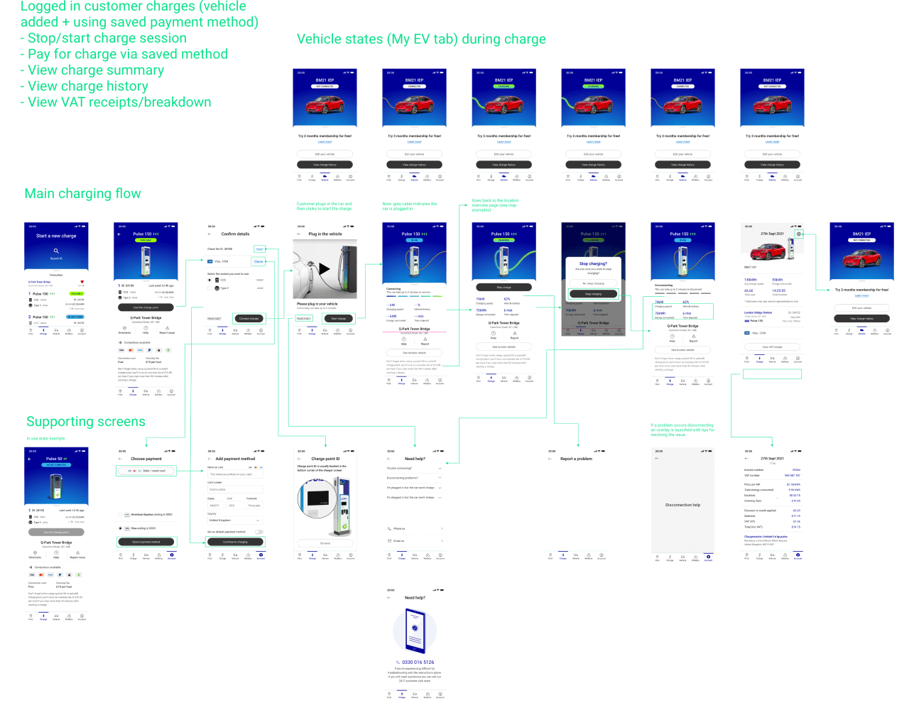
I initially assumed showing a vehicle charging state was unnecessary. The research showed customers, particularly newer owners, had genuine anxiety about whether they'd connected correctly and whether charging was actually happening.
I redesigned the charging flow around reassurance, not just function. This also directly informed the decision to make fault reporting a core feature.

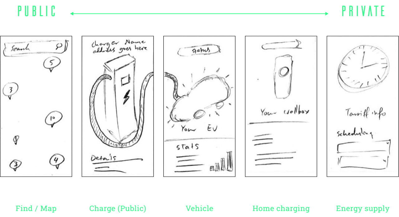
Early sketches mapping the public-to-private charging spectrum across five core sections of the unified app.
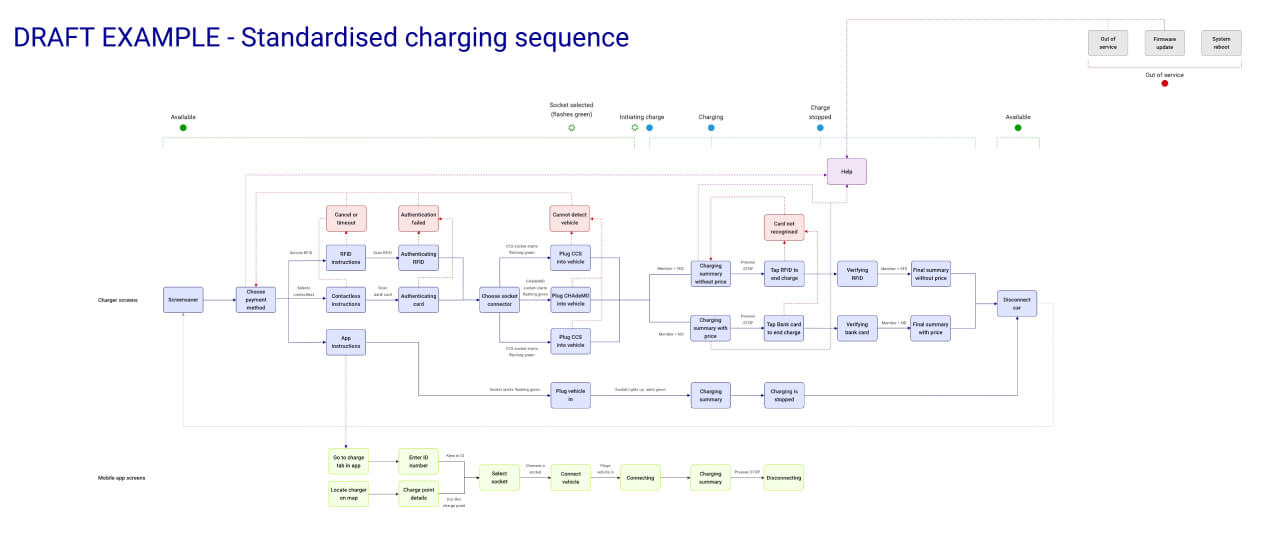
Fixing the app alone wouldn't fix the experience. I pushed for the physical units to be brought into scope.
I worked with engineering and procurement to map every unit's screen sequence, interaction steps and physical constraints across all 9 manufacturers. From that I designed a single unified flow — so any customer who'd used one BP Pulse machine could use any other without relearning.
The machines had limited ability to self-report faults. Rather than waiting for a hardware fix, I designed timestamped user-submitted fault comments into the app as a practical workaround.
Engineering, procurement, signage and product weren't talking to each other. I introduced them and facilitated conversations across workstreams. Teams agreed to pool resource on shared problems, expanding scope without increasing cost.
Connecting the UK and global signage teams led directly to a significant reduction in signage manufacturing costs across Europe — the UK team had a supplier that severely undercut the one being used globally.
Signage was incorporated into the northstar vision as a future capability, enabling charger booking via digital signage as the estate modernised. The app was architected to support this without a rebuild.

Charging station concept
The unified app achieved 4.5 stars on the App Store and Google Play. The unified machine flow was rolled out across all 9 unit types after the project concluded.

Head of Design at BP Pulse
“Alison joined my team in 2022 at a time where I needed autonomous and versatile Senior designers operating at Lead level. She has excelled in her mission, executing User Research, synthesising findings (journey maps, reports), challenging status quo, and exploring suitable solutions for the problem statement we had at the time.
I recommend Alison highly!”
UX
UI
CRO
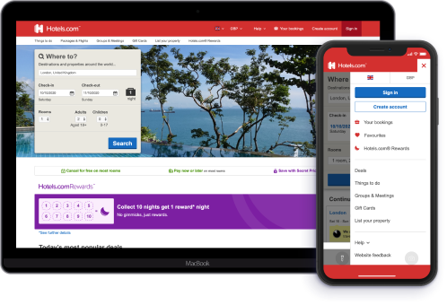
80% of Trainline customers were checking out as guests, limiting their ability to manage bookings and driving up contact centre costs. I led the design of a non-intrusive sign-in and registration system across UK and international platforms, testing multiple approaches to find interventions that increased logins without disrupting the booking flow. The result was a 59.2% increase in logged-in transactions on international mobile web and a 20% increase in registrations.
Research
UX
UI
CRO
As part of a rebrand, I redesigned the global navigation, balancing conversion goals, usability, and space for future offerings. By streamlining 89 regional variations and collaborating with stakeholders, the new design boosted engagement and conversions, adding USD $1.1M annually.