Client

Hotels.com

Project

Global navigation redesign

My role

Senior Product Designer

Summary

With a brand refresh launching, the global navigation and its 89 point of sale variations needed a redesign to clear the clutter and make it flexible enough to grow with the business.

The problem

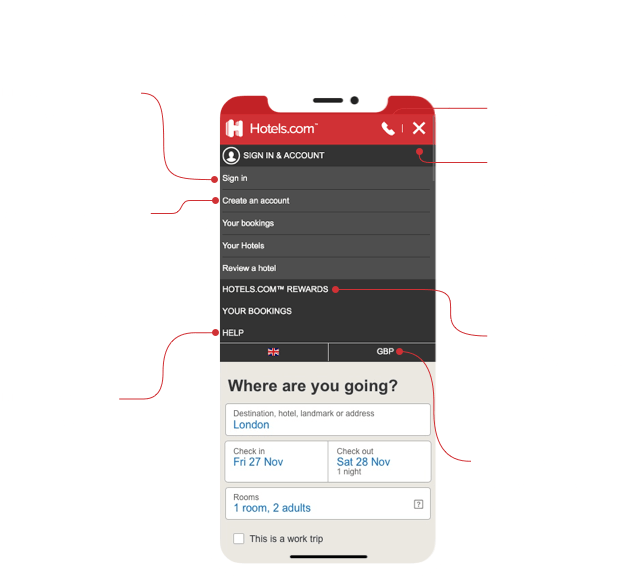
Over time more and more content had been added to the global navigation making it cluttered. The mobile design suffered from poor discoverability and the overall aesthetic of the header felt dated.

Goals

Improve sign in rate

Improve self-service for existing bookings

Reduce sales calls to the call centre

Increase flexibility for sub-brand placement

Modernise the aesthetics of the header in line with the rebrand

Have a neutral or positive effect on conversion

Goals

Improve sign in rate

Improve self-service for existing bookings

Reduce sales calls to the call centre

Increase flexibility for sub brands placement

Modernise the aesthetics of the header in line with the rebrand

Have a neutral or positive effect on conversion

My role

As lead designer on this project I worked with our analytics team and a project manager, reporting directly to the Director of Product Design and VP of Product.

I also liaised extensively with the loyalty team, global call centre team, marketing, legal and other product design pods to ensure the design was flexible enough to meet the goals of different business sectors and would grow with them.

The process

Audit existing header

Competitor analysis

Review analytics

Gather objectives from stakeholders

Initial wireframes

Review with stakeholders

Iterate wireframes and user interface

Review with stakeholders

Prototype and demo

Final designs

Presentation to stakeholders

Development

User acceptance testing

Multi-variant test in key regions

Analyse results

Iterate

Insights

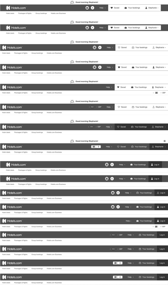
We found that a number of the links in the header had very low traffic and as such could be either removed or placed in a sub-level of navigation where its discoverability wouldn’t be overly hindered.

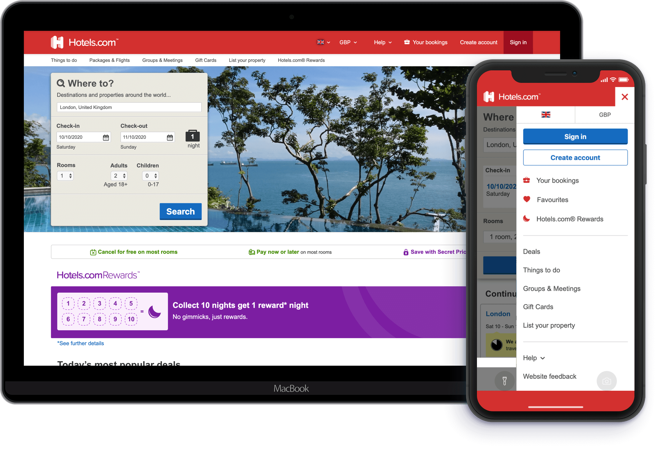
On mobile prior testing had shown that our customers found the burger icon confusing so we retained the existing avatar icon for the menu.

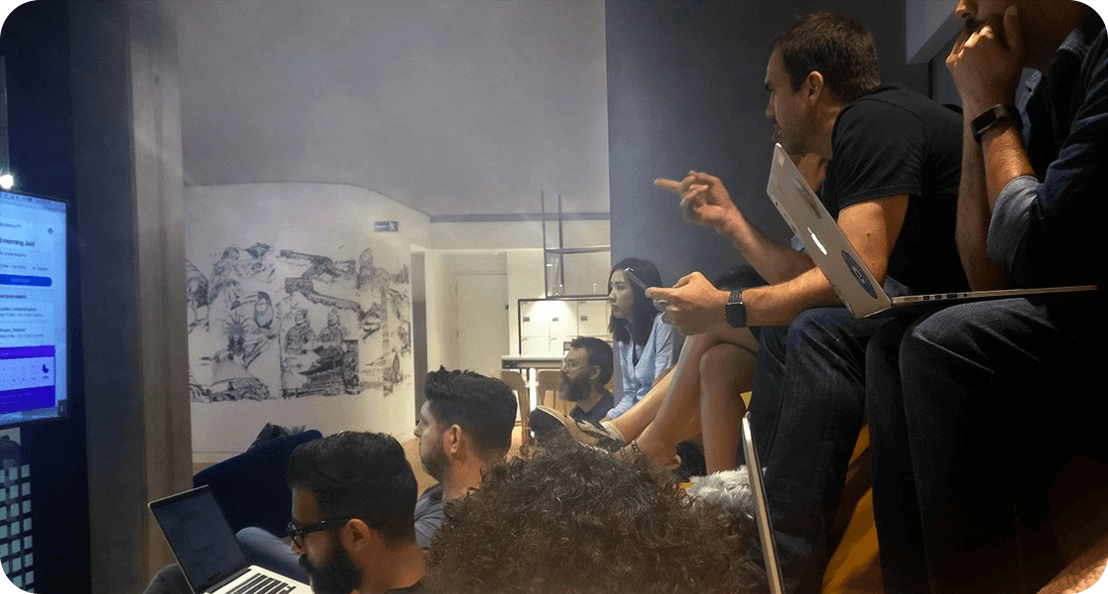
Presenting my initial designs to the Product team at our weekly design critique

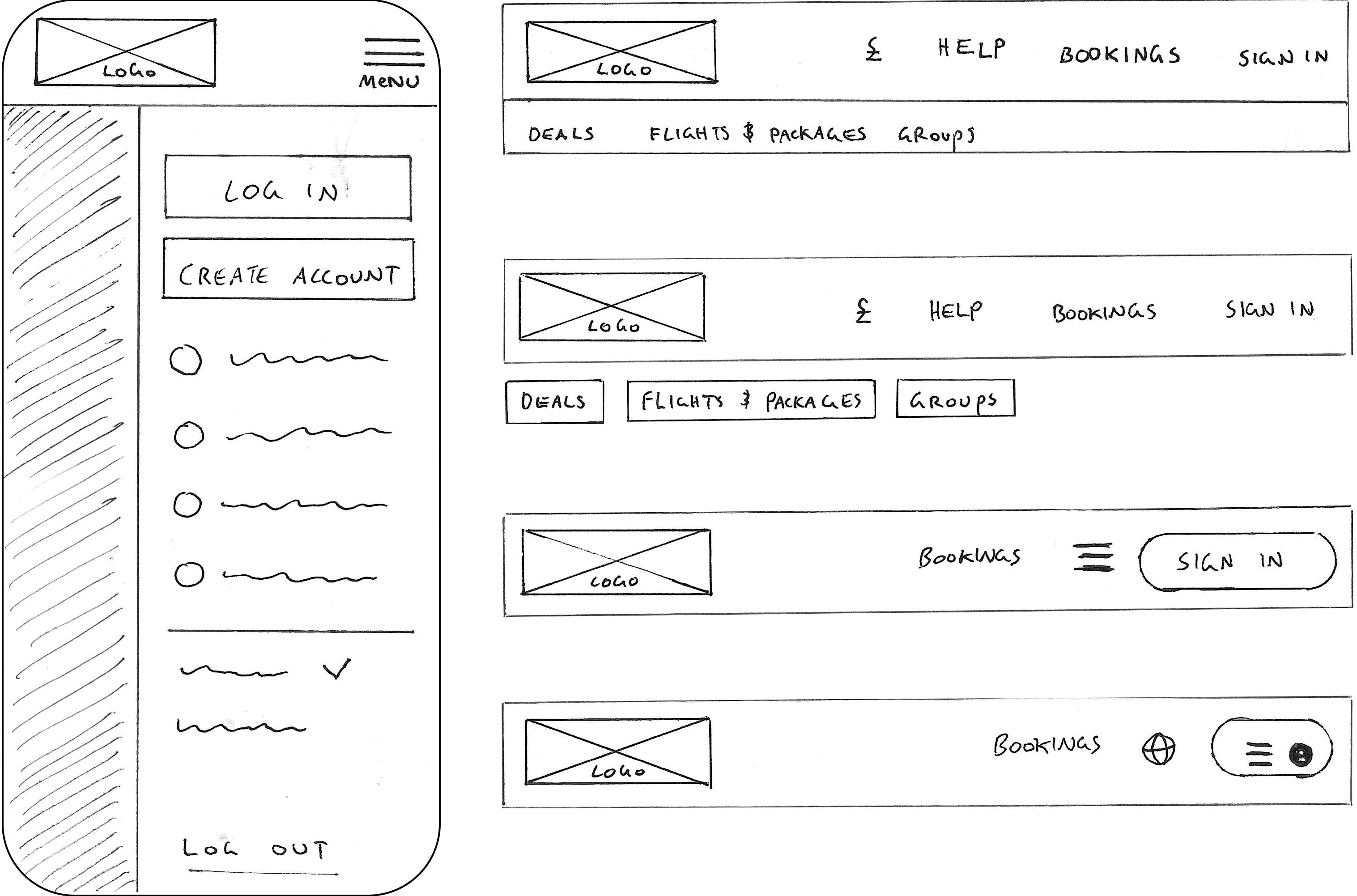
Variations of mobile and desktop navigation that were explored

Considerations

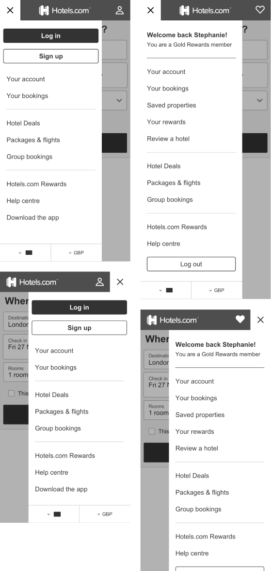
The loyalty team wanted to ensure a user's loyalty tier was emphasised when logged in and post-stay review links remained discoverable.

The call centre was aiming to make a dramatic shift in the coming year from sales focused to customer service focused which allowed me to remove the phone number from the top level of navigation. We aimed to improve self-service processes for making and changing your booking on the site but we still wanted to ensure if a customer needed to speak with someone it would be easy to find the customer service number. Silver and Gold Rewards members also receive a priority phone number as part of their membership benefits so this still needed to be discoverable.

The icon set needed to be reviewed but was out of scope for this project. The roll out of new icons across the website and app will be part of a second release.

New, more stringent privacy laws meant we could no longer simply display a link to our cookie policy in our navigation. The cookie policy would now display as a modal which meant it could be removed from the menu.

Outcome

The initial test was run against a control and a variant of the control with the phone numbers removed. It was run for a total of 30 days in 4 points of sale spread across 4 different regions (USA, France, Brazil and Japan).

A follow up MVT was run to build off the insights gathered before launching the new design across all 89 points of sale.

Increase in conversion grossing an additional USD $1.1 million each year

Increased sign in on desktop and mobile

Increase in continuation to the booking form across all platforms

Huge reduction in call centre calls

Reduction in bounce rate across all platforms

Increase in visitors to the search results page on mobile

Reduced clutter and provided space for future propositions

Brought the header in line with rebrand guidelines

See more work

Family Pooling - Emirates Airlines

Emirates were looking to increase the value and flexibility of their loyalty program by introducing the ability to pool your reward miles as a family. This was a new proposition for Emirates that needed to work seemlessly with their existing loyalty program.

Read the case study

Landing pages - Dune London

With more than 48% of all website views and a third of revenue originating from mobile devices each month their mobile site was in dire need of rejuvenation to maximise sales and meet their consumer’s expectations.

Read the case study